
For Vejbred, I created a visual identity that challenges the conventional look of nature-focused organisations. While many rely on muted tones and safe green palettes, we wanted to do something different—not to distance ourselves from nature, but to reflect its full spectrum, especially as it exists in the city.

Working with Vejbred, the challenge was twofold: limited resources and a strong desire for a distinct identity. With no in-house graphic designer, the visual system had to be simple, intuitive, and easy to activate—something the team could implement independently across future materials.
The goal was clear: to create a simple, accessible, and authentic design system that could live and grow within the realities of a small, resource-light organisation. Vejbred doesn’t have a dedicated communications team—its work is carried by passionate people with diverse backgrounds, including volunteers. So the identity needed to be easy to understand and use by everyone, not just designers.
We created a simple, stamp-like logo, a bold season-inspired color palette, and an expressive yet legible typeface. We also created five organic graphic elements to tie everything together.The system is easy to use in Canva and Wix—designed for flexibility, recognisability, and hands-on use by the Vejbred team.


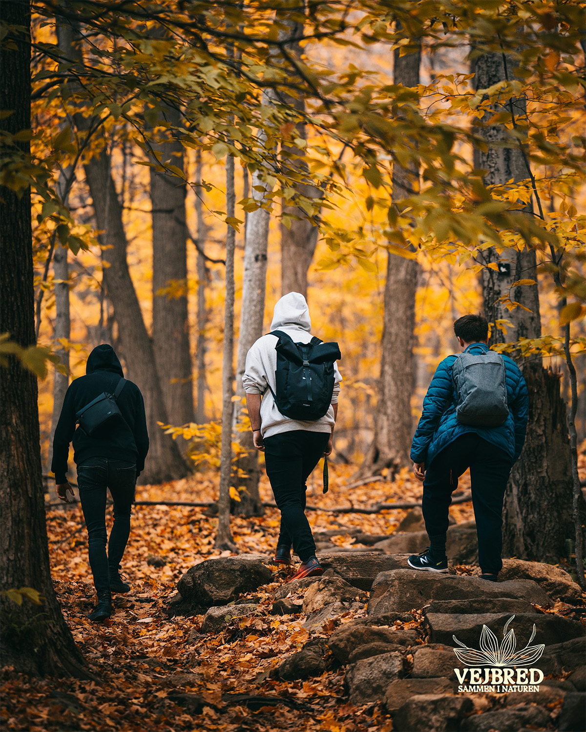
What if urban life wasn’t just about speed, consumption, and concrete — but also about listening, growing, and healing? Say hi to Vejbred. A small but powerful initiative rooted in the heart of Copenhagen, inviting you to slow down, step outside, and rediscover the wild beauty just around the corner. No gear, no experience—just curiosity and community.


Let’s get in touch! Fill out the form below, and I’ll get back to you. Whether you have a question or want to start a project, I’m excited to hear from you and will get back within 1-2 workdays.

